Go-Ventures rebrands to Argor, with brand identity created by Design Bridge and Partners
Argor Capital Management Pte. Ltd. (“Argor”), an independent Southeast Asia-focused investment firm formerly known as Go-Ventures, today announces the launch of its new name and visual identity. Created by Design Bridge and Partners, the WPP revolutionary design partnership, the rebrand reinforces the investment firm’s strategic direction and independence as it targets high-growth startups across Southeast Asia.
Argor was established in 2018 with the backing of GoTo (then known as Gojek prior to its merger with Tokopedia) as an independent but ecosystem-linked investment firm. Argor invests in high-growth startups across the rapidly growing markets of Indonesia and the rest of Southeast Asia. With the success of its first venture fund, a decision was made to rebrand as “Argor” to reinforce the investment firm’s independence and expanded capabilities to drive growth for its portfolio companies.
The new name and visual identity is underpinned by the brand message “genuine performance”, representing Argor’s mission to be truly authentic in its commitment to founders and investors.
The new brand name “Argor” – derived from the words “ardor”. “rigor” and “Go” – was created by Design Bridge and Partners to convey the dynamism, transparency and relentless pursuit of excellence that Argor encapsulates in its mission to support Southeast Asia’s fastest growing companies. The name has been brought to life through a new logo - a bold and sleek wordmark - crafted to reflect Argor’s determination to always create impact in everything they do.
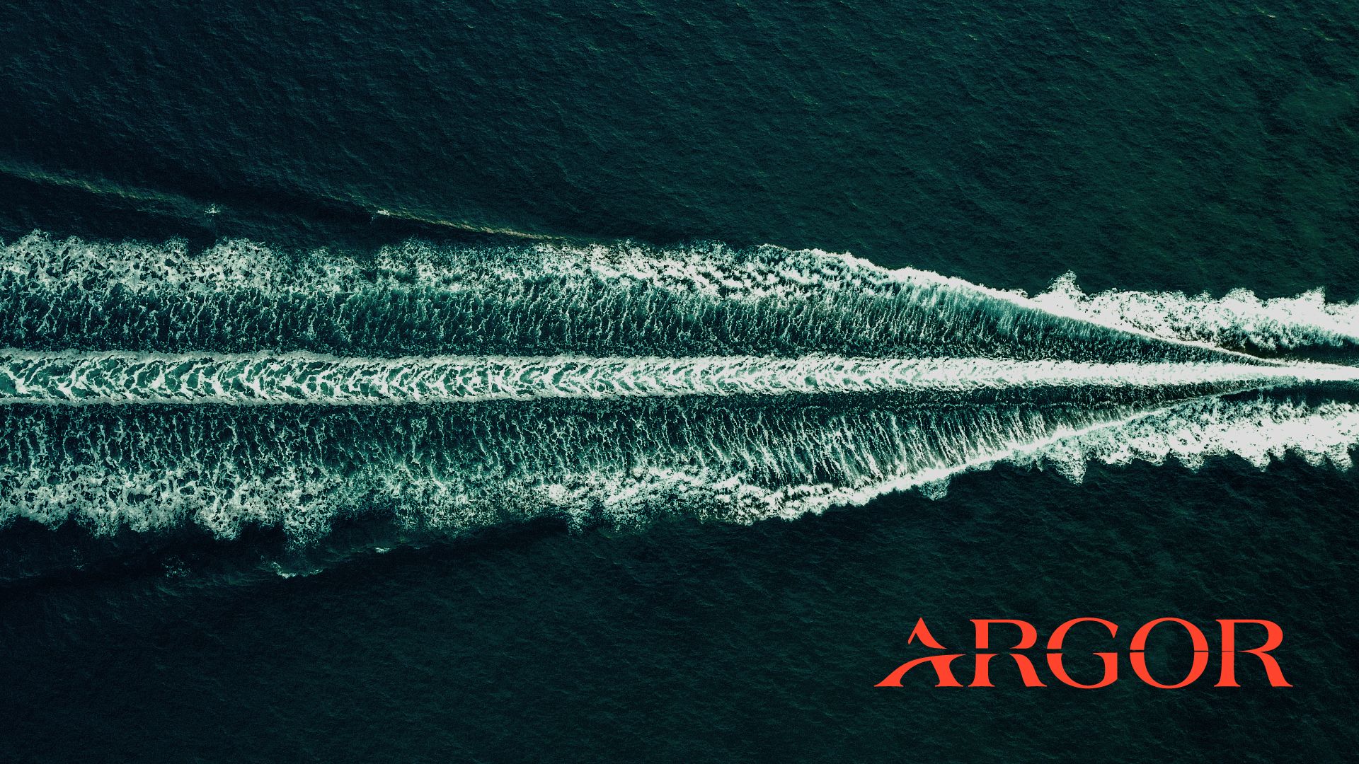
A fresh, distinctive and contemporary colour palette and combined typeface have also been designed to serve as a manifestation of the brand. The dark green colours throughout the identity deliver on trust, experience and gravitas while the light blue indicates Argor’s openness towards different partnerships and experiences. Injecting a distinct pop of vibrance to the colour palette is bright orange, which represents the brand’s tenacity and the bold ambitions they have set sight on. The fonts, Canela Text and Archivo, a modern and sophisticated combination, have been chosen as the brand’s typography to be used across all brand communications.
Argor’s new photography style will further enhance its brand mission. Abstract images establish them as a strong but quiet force, capturing the trails of impact they leave behind, whilst environmental imagery can be used to tell the brand story and mission, focusing on unique perspectives capturing the alluring charm of Indonesia's landscapes. People photography will be natural and relatable, showcasing its collaborative spirit and attention to detail. All photography styles can be supported by a series of brand graphics.
“It was a privilege to support Argor in its journey to re-establish its identity at a time of strong growth for the brand. Together we have built an exciting and refreshing identity that captures its commitment to founders and the investor community, maintains its important connection to GoTo and bakes authenticity and passion into its very DNA.”
— Ambrish Chaudhry, Head of Strategy, Design Bridge and Partners