Making every moment matter. Cancer Research UK reveals refreshed brand identity created by Design Bridge and Partners
Cancer Research UK, the world’s largest charitable independent funder of cancer research, today announces the launch of its refreshed new brand identity.
Created by Design Bridge and Partners, the WPP revolutionary design partnership, the refreshed brand reflects the positive impact the charity’s work is having on the lives of people affected by cancer.
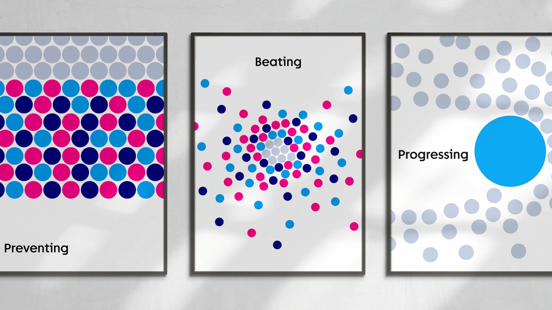
The creative concept aims to unite Cancer Research UK’s scientific and research breakthroughs with what this means for cancer patients and their families every day – the invaluable life moments that they’ve been able to enjoy thanks to research.
By evolving its strapline from ‘Together we will beat cancer’ to ‘Together we are beating cancer’ the charity moves away from the idea of finding a ‘single cure for cancer’, towards focussing on the progress that is being made every day by scientists and researchers across the UK.
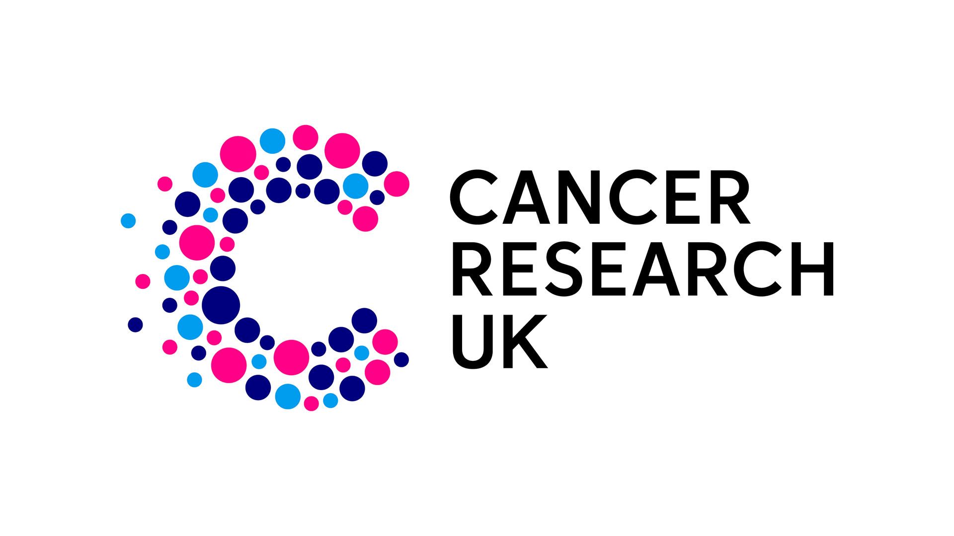
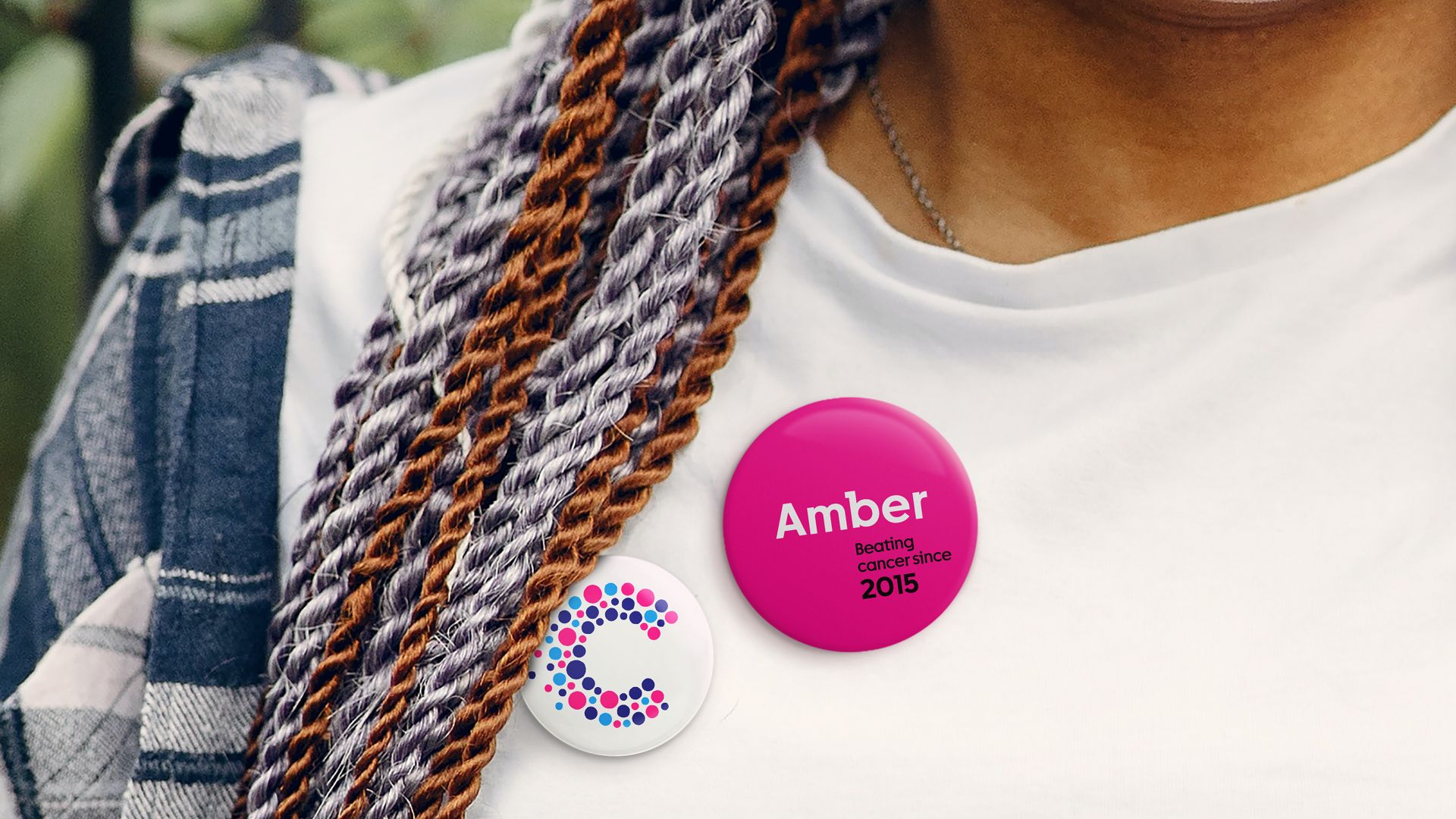
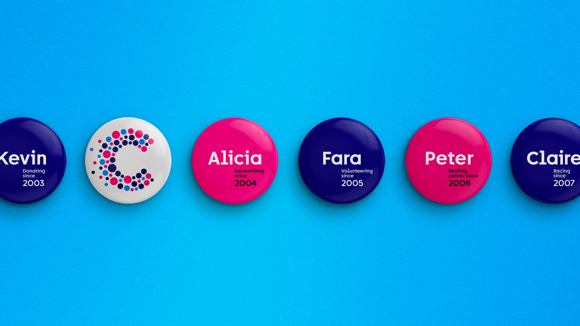
A fresh evolution of Cancer Research UK’s existing logo supports the refreshed visual identity. The logo brings together circles that each ‘pinpoint' a moment in time in the collective journey in beating cancer, with all moments coming together to form the letter ‘C’. The logo has also been simplified to achieve maximum impact in print and on digital platforms, while the existing primary colour palette of magenta, cyan and navy has been retained for its recognisability and boldness.
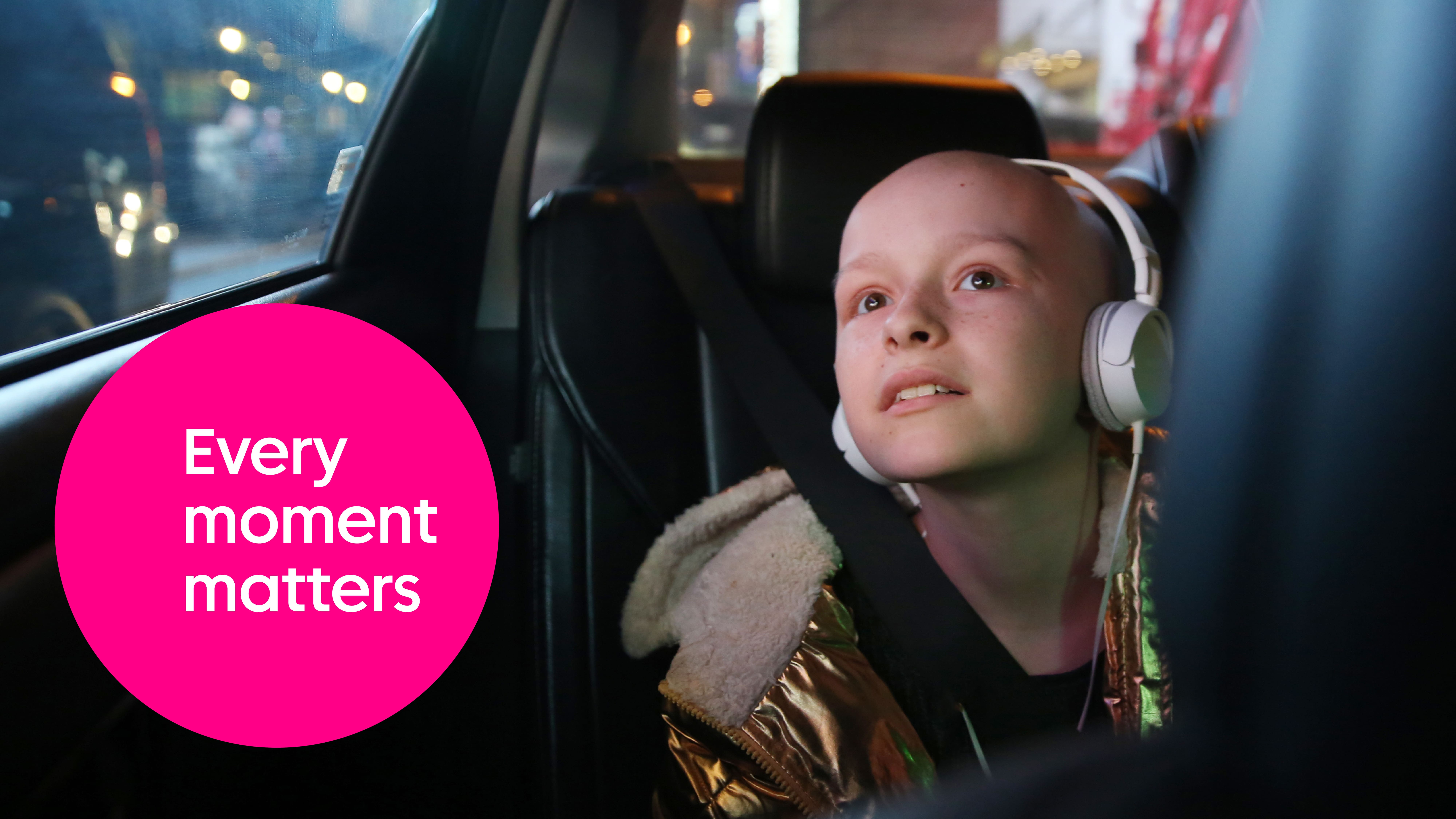
Design Bridge and Partners has also developed a new photography style for the brand. This shift in imagery style aims to show real life and everything that it can mean. As such, authentic, candid images of each audience group will be seen. Following the principles of being real, live, active and empathetic, the new style is authentic and distinctive.
A typeface has also been evolved to support the refreshed brand expression, with a sans serif and slab serif being merged to form a unique hybrid font. The duality of the font will help the brand speak to its multiple audiences in a consistent way.
Dave Roberts, Creative Partner, and Leanne Kitchen, Senior Designer, Design Bridge and Partners, jointly said, “It was a privilege to support Cancer Research UK in its journey to refresh its visual identity. By placing science at the forefront but through a lens of genuine human moments, the refreshed visual identity strikes up the perfect balance, honouring the variety of incredible contributions being made each day to this urgent and critical cause.”
Philip Almond, Executive Creative Director of Marketing, Fundraising and Engagement at Cancer Research UK said, “We’re shining a brighter light on how our research is making an incredible difference right now in improving outcomes for people affected by cancer. Cancer survival in the UK has doubled in the last 50 years and we’ve been at the heart of that progress. Every day we see the impact of our vital work on those affected by cancer and their loved ones.
“We want to inspire people to see that our progress is their progress. And this progress is only happening thanks to their support. Refreshing our brand gives us the opportunity to get better cut through in a competitive fundraising environment and demonstrate the human impact of our vital work in an engaging and inspiring way. Supporting Cancer Research UK is being part of the solution to beating this awful disease and bringing about a world where everybody lives longer, better lives, free from the fear of cancer.”