Shelter

Igniting the spirit of activism of its grassroots origins, a new brand for Shelter designed to disrupt and represent the fearless and unstoppable determination to fight for everyone’s right to a safe home.
From a grassroots organisation to support the homeless on Britain’s streets to a national movement that stands up to the system and says ‘enough is enough’, Shelter is built on the belief that everyone has the right to a safe home. The new brand is designed to create a national movement. To fight and to win for everyone’s right to a safe home.
Sector
Public Sector & Non-Profit
Partner
Who Wot Why
There Is Studio
Expertise
Brand Strategy
Brand Identity
Brand Experience
Communications
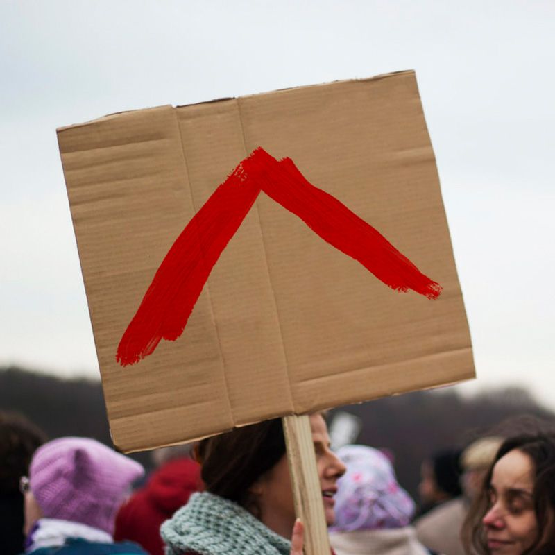
We took Shelter back to its roots. Inspired by the visual language of protesting and the grassroots movement Shelter came from, we introduced an aggressive red brush stroke visual language. It’s designed to disrupt and represent their positive presence.
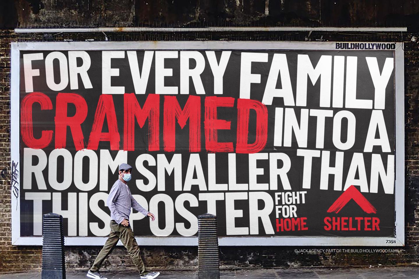
A font was also designed and designed from detailed brush strokes to capture the real movement and urgency in each letter. With up to 10,000 points per character, the authentic detail in each hand painted letterform is intricate and pushes the limits of what’s technically possible when turning the letterforms into a digital font.


We created a simple toolkit and symbol that exists in the hands of the people who use it the most and empowers supporters to take their message to the streets.


Everyone has the right to a safe home and the new Shelter brand will make sure that everyone knows this.
Adrian Burton
Creative Partner, London
