Shakespeare’s Globe
Colliding old and new for a new generation. Shakespeare’s Globe delivers an extraordinary experience in learning and emotions, love, tragedy, revenge, comedy and joy. It’s raw, real, and more than any other theatre, it’s alive.
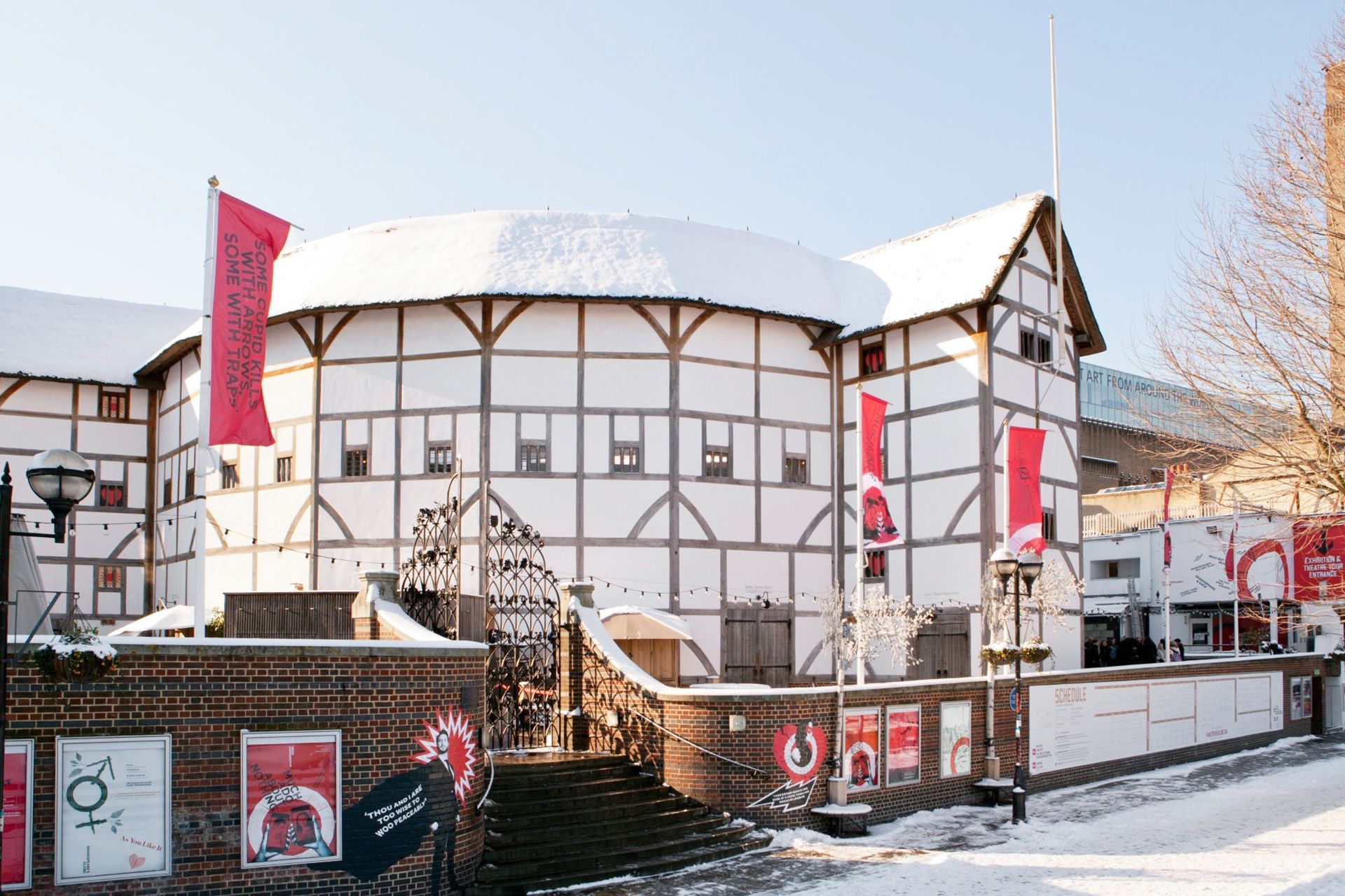
The Globe is like no other. With a vision of making Shakespeare accessible to all, it is a faithful reconstruction of the open-air playhouse from Shakespeare’s times. Here you can really hear what the first audiences heard and see what they saw. We conjured an identity that is equally creative, experimental and expressive – and relevant for a modern audience.
Sector
Public Sector & Non-Profit
Expertise
Brand Strategy
Brand Identity
Brand Campaign
Launch Campaign
We embraced the artistic ethos of the Globe. Our approach was not to solve, but to explore, which allowed the guiding principles of the brand – radical, irreverent, physical and experimental – to emerge.
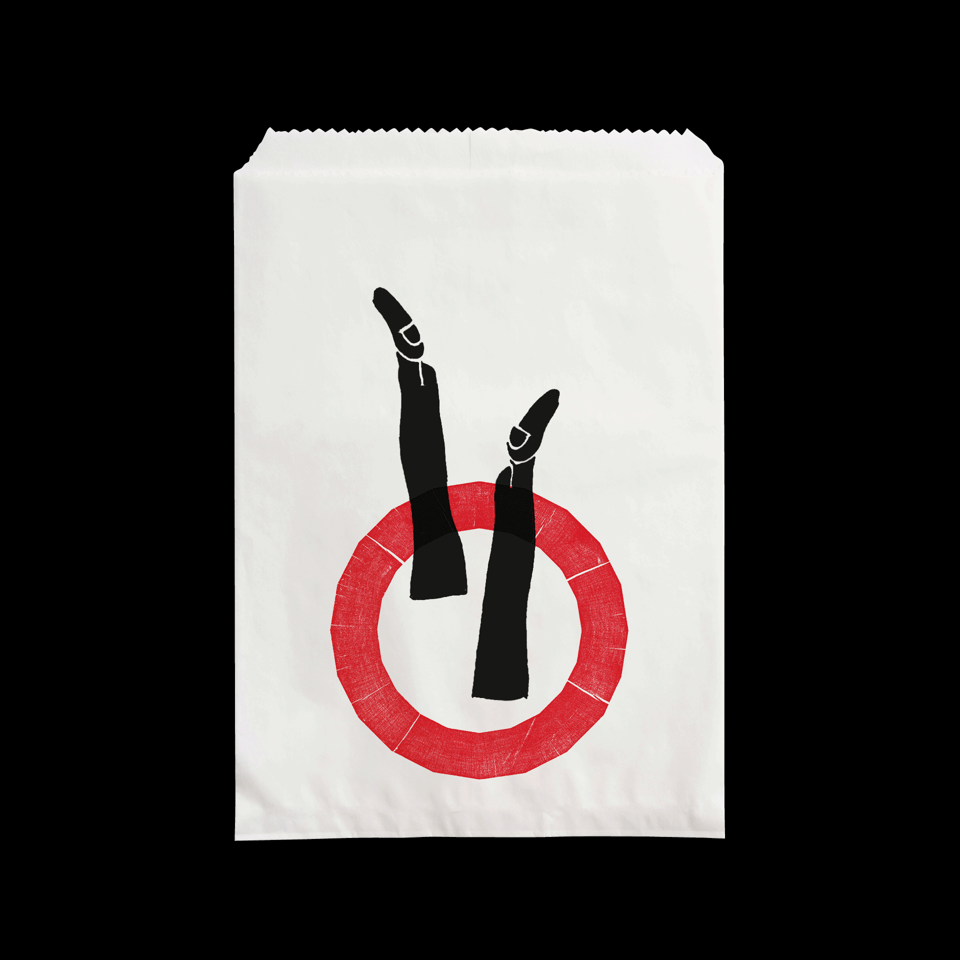
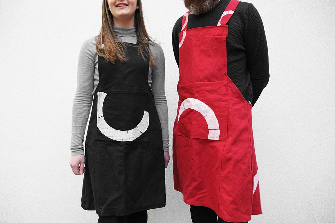
For the new identity the last piece of the original timber used to rebuild the Globe was hand-carved into the distinctive 20-sided shape. A red ink print of the block by printers, St Brides’ Foundation, retained the grain of the wood in the print and became the symbol of the brand. In an echo of the Elizabethan tradition, the mark has no fixed size or position – a freedom of movement that is contemporary today.


The identity is firmly founded on the unique essence of the Globe’s amazing architecture and really brings to life the key tenets of our new Cause and brand model.
Neil Constable
Chief Executive, Shakespeare’s Globe
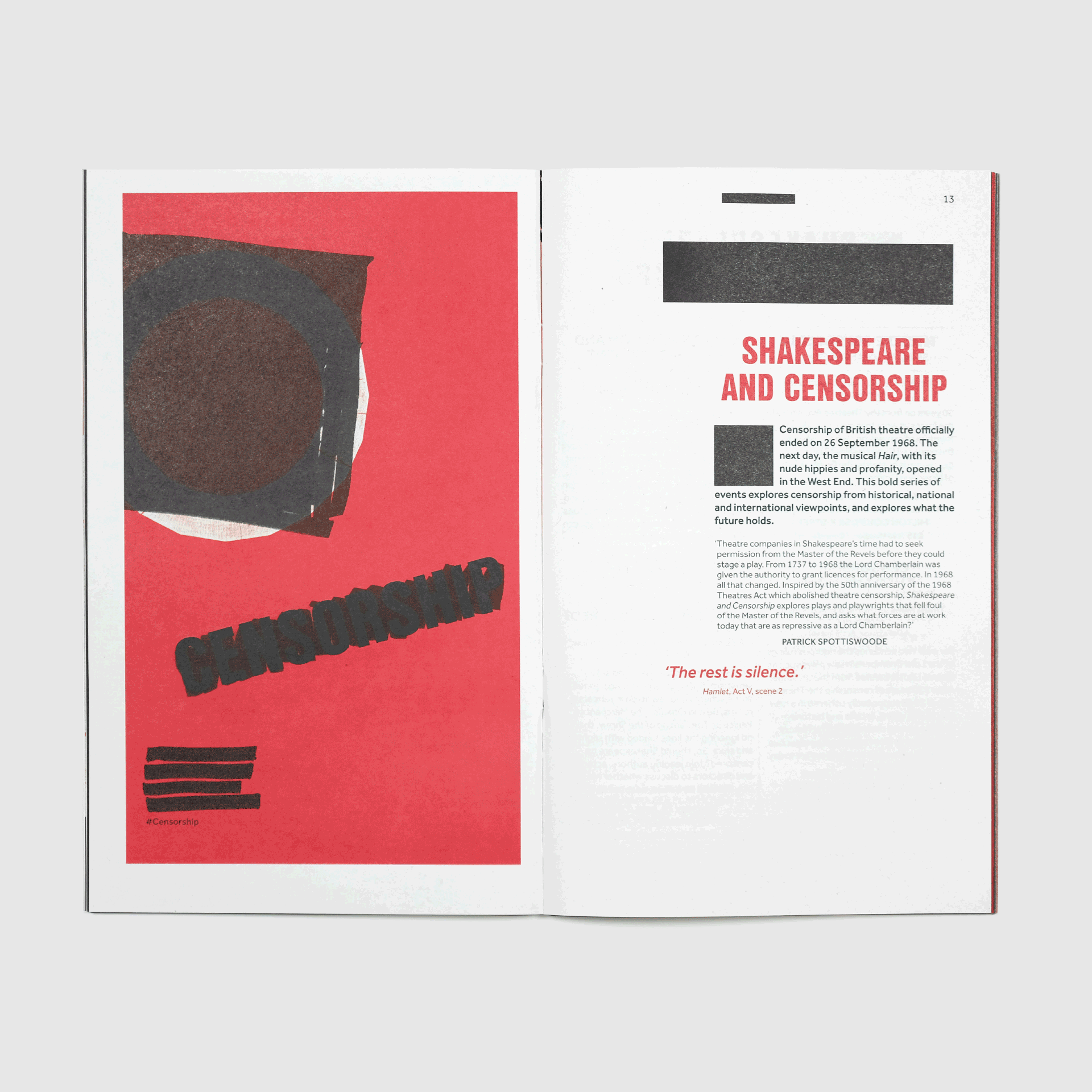
The colour palette - shades of red, black and white – is drawn from the inks available to printers in Shakespeare’s time. The editorial design of the season’s brochure follows the template of the first Folio, the original 1623 layout with a new modern prominence.
We continue to work with Shakespeare’s Globe, the latest project being radical experiments with its commercial merchandise and communications.